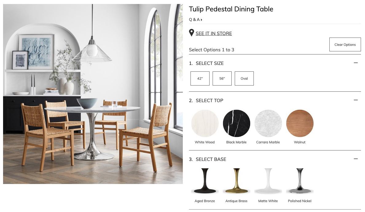
Client Williams Sonoma Home
Type UX / Product Design
Role Designer

A selection of redesign projects completed while working at Williams Sonoma Home, spanning e-commerce UX, seasonal landing pages, and site-wide navigation.

01

The Problem

The original design split the Saarinen Table product range across eight separate pages — one for each combination of base material and top shape. This meant customers had to navigate multiple pages to understand the full range of options, creating a clunky and confusing shopping path.
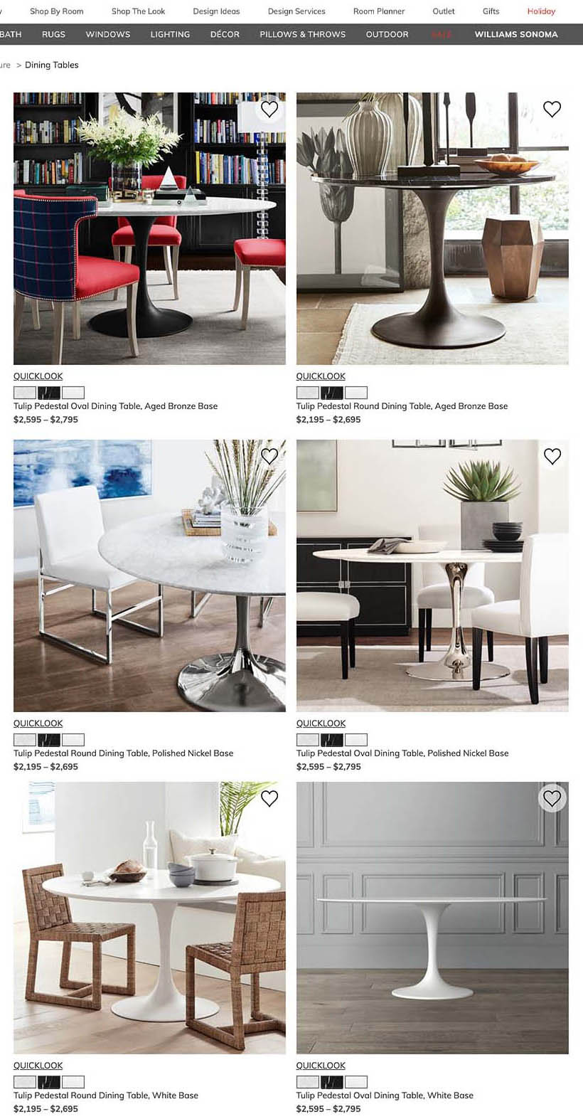
The original eight Saarinen Table product pages
02

The Solution

All product attributes were consolidated onto a single page. Size and shape attributes were grouped together, with top and bottom material options positioned below — allowing customers to clearly see every available configuration without leaving the page.

The consolidated Saarinen Table product page
01

Design Ideas & Inspiration

The design accommodated seasonal content changes where certain elements would shift while maintaining the overall structure. A modular component approach allowed sections to be removed, replaced, or rearranged without requiring a full page redesign multiple times a year.

Design Ideas & Inspiration landing page — desktop
02

Collection Pages

Multiple collection pages were needed to house products spanning different categories while preserving visual consistency. The design emphasised large product imagery alongside concise bullet points describing each collection.

WSH Planter collection page
03

WS Cares

A content-dense page requiring substantial information to be presented in an engaging and easily digestible format across both desktop and mobile.

WS Cares page — desktop
01

The Problem

The existing header and navigation contained too much content, pushing nearly half of the hero section below the fold on load. This reduced the immediate visual impact of the homepage photography and obscured key product information on product pages.

The original site header and navigation
02

The Solution

The header was reorganised and redesigned to deliver a cleaner, more elevated feel — removing visual noise and consolidating navigation into a hamburger menu. The result was significantly more hero visibility on the homepage and clearer product information on product pages.

The redesigned site header with hamburger navigation
03

Navigation Detail

The expanded navigation states were carefully designed to surface sub-categories clearly. Each level of the hierarchy was considered to ensure customers could orient themselves and reach product categories in fewer steps.

← Back to Work